The Project
Now Touring: Public Art Billboards shines a spotlight on artwork from Calgary’s Public Art Collection by making it part of people’s daily commutes. The majority of these works are currently in storage and not on display to the public, so this gives the public a chance to enjoy them as well as to bring beauty to areas of the city that don’t have as much public art.
The second series of artworks from the collection, titled All Together Now, is launching on billboards starting September 10, 2024 and shares stories of “togetherness” through art. These 10 artworks are curated by Ginger Carlson and will be on display through December 2024. The featured artists include: Zoe Dunning, Helena Hadala, Mary Spice Kerr, Roy Kiyooka, Douglas Motter, Marion Nicoll, Katie Ohe, Dr. Jane Ash Poitras and Wendy Toogood.
Curatorial Reflections by Ginger Carlson
All Together Now includes nine artists and 10 artworks that speak to the passing of time and how shifts in our perspective shape how we see and engage with the world around us. Through their artistic practices and critical approaches to art and community building, these artists represent a web of connections and influence that has shifted the creative landscape of the province, influenced generations of artists, and made significant and far-reaching contributions to the evolution of modern and contemporary art and Canadian art and culture.
Technology has allowed us to live alongside and interact with people and ideas we may have otherwise never encountered — across lands, oceans, time zones, perspectives, and ways of life. Our ever-expanding access to virtual and physical spaces can make life feel both richer and more exhausting. The world is at our fingertips, and the temptation of immediacy spills over into every aspect of our lives. We rush through traffic, we rush to return texts and emails, we rush to find out information, and the present moment collapses—not a moment really, anymore, but an ellipsis that stretches and binds our lives to physical, virtual, and psychological spaces that constantly demand our attention, pulling it in a thousand different directions all at once.
Each of the works in All Together Now invites us to follow a different sort of tempo, one that is considerably slower and more meandering than we may be used to. They encourage our eyes to wander, our minds to speculate, and hopefully, they enable us to pull our attention toward the ways we move through time and the many spaces we occupy, both as individuals and as part of the interconnected fabric of beings that form the world around us.
We may often feel separate from the dirt and insects, the trees and their long roots, the bison that once watched over this place in the millions, and the prairie skies that go on and on and on. Like the horizon line, these lines, too, are more a product of perspective than anything else. We are rooted here, even if it’s just for a little while. As our skin cells form another layer of sediment around us and the animals, plants, and the skies mark seasons of change, we learn, grow, and shift, every moment turning swiftly to the next.
We are, each of us, much more than the sum of our parts, our journeys, our selves. We are — if we choose to be. The curving paths of our lives hold it all: the relationships we nurture, the people we inspire and inspire us, the lands and deep histories we traverse, and the stories we tell and repeat. Our lives have impact and power. Our choices never happen in isolation; they echo, they ricochet, they tip the scales. Across time and generations of creatures, formations of the land and water, and the many varied physical and non-physical spaces we inhabit. We’re not as far apart as we may seem.
The 10 works in this exhibition stretch across many generations, with one work dating back nearly 100 years. Two artists featured here, Douglas Motter and Marion Nicoll, were among the small group of artists who built the Calgary Allied Arts Foundation, the origin of Calgary’s civic art collection. All the artists included here are icons in their own right — their artworks, artistic practices, and contributions to arts and culture have shifted hearts and minds, carved out space for communities to flourish, and formed new languages of material practice that have become central to how we understand and relate to this place. We’re not as far apart as we may seem, so why not slow down and linger awhile in the possibility of moving through worlds together? Why not shift into a different kind of being alongside one another? After all, we’re all together here, and now.
Select an artist below to learn more.
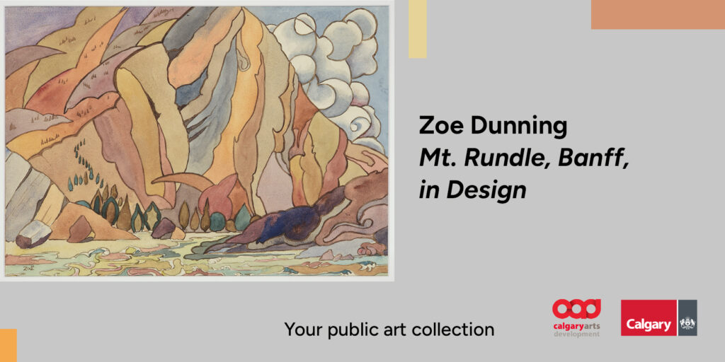
Zoe Dunning, Mt. Rundle, Banff, in Design, watercolour on paper
Zoe Dunning was a painter born in Sussex, England, in 1877 who immigrated to Canada in 1896. She studied under British watercolourist A.C. Leighton and was primarily known for her watercolour studies of flowers, which she exhibited regularly and often donated to benefit charitable causes. In her other artworks, she explored still-life subjects and landscapes, especially the mountains around Banff National Park. Dunning participated in the first exhibition held in Toronto that exclusively featured works by Albertan artists, alongside fellow watercolourist Laura Evans Reid.
Mt. Rundle, Banff, in Design is a watercolour painting on paper depicting a sun-dappled view of Mount Rundle, a 12-kilometre mountain range between Banff and Canmore. In the painting, Dunning depicts Mount Rundle like we are standing at its base with its towering peaks stretching beyond the frame. Nearly every aspect of the landscape is formed by distinct shapes painted in soft washes of earth-coloured tones enclosed within bold ochre lines. The individual shapes blend together, giving the work a flattened sense of depth that allows for visual slips and misidentifications. The pointed forms of rocks echo lines of lumpy trees, curling clouds tumble down the mountain side or bubble out from behind it, swirling grasses or lichen pattern the ground at our feet. In this way, Dunning captures shifts in light and perspective in an almost abstract fashion. The approach gives every shape a kind of immediacy, as if recorded one-by-one, as the soft light of the sun touches and changes each and every form.
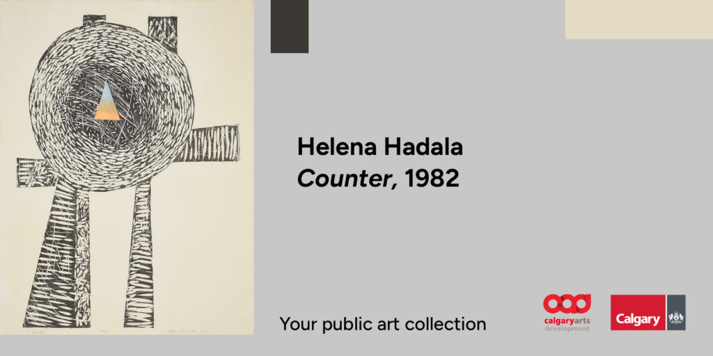
Helena Hadala, Counter, woodcut on paper, 1982
Calgary-based visual artist and educator Helena Hadala describes her artistic process as a way to seek stillness. In 1980, Hadala travelled to Japan and studied Japanese woodblock printing with master Toshi Yoshida and panel and scroll-making techniques with Nakaji Ichikawa. Deeply influenced by these experiences and an emerging interest in Zen Buddhist philosophy, Hadala’s work after this point solely explores abstract forms.
Counter, created two years after her return from Japan, is a woodcut print on paper featuring intersecting abstract shapes printed in black ink and textured by hundreds of short lines carved into the woodblock. Resembling something like almonds or grains of wheat, the lines were produced by the slow and repetitive process of marking a woodblock with a tapered carving knife. Full of movement and energy, these dynamic lines symbolize the external forces that seek to direct our life paths. Inside the work’s central circular shape, tightly packed lines swirl around and around, becoming thinner and less pronounced as they reach its centre. Here, we find a precise triangular shape washed in a gentle colour gradient that moves from blue at its narrow point at the top to orange at its base. This area represents an internal sense of calm and was created using repeated layers of thinned paint, a technique called bokashi in Japanese woodblock printing. The contrast between the energetic cut lines and the hazy calm found within the triangle inspired the work’s title, Counter, a reference to the pursuit of finding a balance between the chaos of the external world and a peaceful stillness within us.
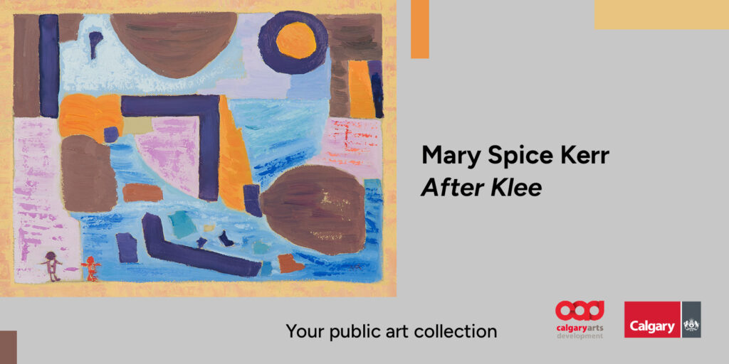
Mary Spice Kerr, After Klee, oil on board
Mary Kerr was an artist, educator, librarian, and archivist born in Yorkton, Saskatchewan, in 1905 and who lived in Calgary for much of her life. She worked as a librarian at the University of British Columbia and the Calgary Public Library and was secretary of the Federation of Canadian Artists. Like many women artists of her generation, particularly those with prominent male artist partners, few details about her life and work have survived.
After Klee is an oil painting of an abstracted landscape. In the work’s title, Kerr references Swiss-German artist Paul Klee, and his influence resonates through Kerr’s use of flattened perspective, playful geometric shapes, and an earth-toned colour palette. In the lower left corner, two tiny figures stand on a thick yellow border, guiding our gaze toward a colourful expanse of geometric shapes. We view the landscape alongside the figures, our eyes shifting between irregular patches of blue, brown, orange, and pink intersected by thick angular lines painted in dark purple. While Kerr’s use of perspective and scale pulls our attention in all directions, by painting a frame and placing the two other observers on top of it, we find that we are not alone as we take in the view. At once seen from the side and from above, Kerr’s use of abstraction invites multiple and sometimes conflicting interpretations of what these ambiguous forms may represent. This openness allows us to create our own connections with the lands, waters, anything and anything else we may imagine within Kerr’s vast expanse of floating shapes.
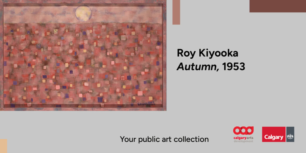
Roy Kiyooka, Autumn, oil on board, 1952
Roy Kiyooka was a painter, sculptor, musician, conceptual photographer, filmmaker, poet, and educator born in Moose Jaw, Saskatchewan and raised in Opal, Alberta. Kiyooka was a prolific teacher and taught at several post-secondary institutions across the country. In 1978, he was honoured as an Officer of the Order of Canada in recognition of his many contributions to Canadian art and culture as a painter, educator, and community builder.
Autumn is one part of a series of works that Kiyooka painted to convey impressions of the seasons. In Autumn, a small yellow disk that could be the sun sits just above a high horizon line with a muted pink sky behind it. Below, and occupying most of the image, small, dynamic square-shaped brushstrokes in fiery reds, deep purples and blues, buttery yellows, and orangish pinks are layered over soft shades of red and pink. Aside from the yellow disk and hazy horizon line, the work does not feature any other elements that can be easily identified and calls to mind how we often don’t recall these quieter moments in nature in precise detail. Like many of Kiyooka’s poems, Autumn speaks to the fleeting nature of our experiences as we move through the world by attempting to hold on to a passing moment. Highlighting the difficulty of this task, Kiyooka extends the vibrant autumn colours beyond the painting’s edge, even onto its custom-made frame. This blurs the boundary between us and the light of autumn, bringing us in for a closer view as it reaches out to meet us.
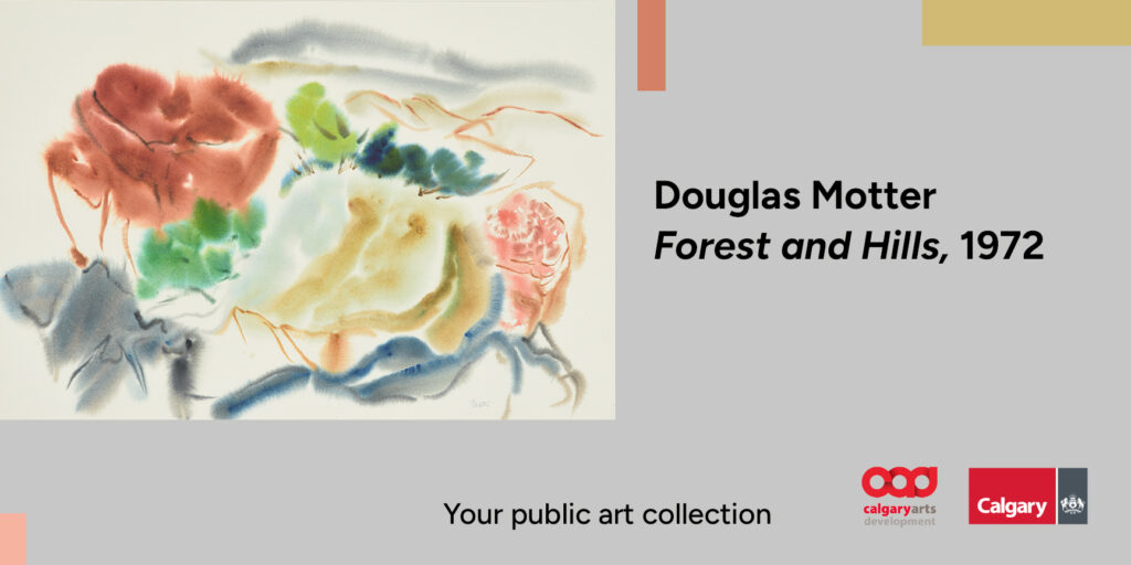
Douglas Motter, Forest and Hills, watercolour on paper, 1972
Douglas Motter was a watercolour painter, weaver, printmaker, and educator born in Chicago, Illinois, who moved to Calgary with his family in 1918. He was a founding member of the Calgary Allied Arts Council and the first weaving instructor at the Alberta University for the Arts. Motter operated a weaving company called Douglas Motter & Associates, which produced and sold hand-woven goods and custom fabrics and hosted a community space for new weavers to build their weaving skills and share resources.
Forest and Hills is a watercolour painting on paper created using the wet-on-wet technique, where water is applied to both the paper and brush before paint pigments are added. This complex technique requires careful attention and precise timing to create the right balance between water, pigment and paper fibres. Here, the technique yields fluid blooms of colour that are soft and feathered at their edges. In the foreground of Forest and Hills, arching lines in grey and blue suggest shapes that might be rock formations. Thin, muddy brown lines trace the edges of hills and valleys and define the horizon line, while soft washes of colour articulate their volume. A line of trees curves across the painting, their foliage softly rendered as areas of yellow-green, blue-green, and amber-red, their trunks as short, sweeping brown lines. Ambiguous and ethereal, Motter’s hazy forms produce an atmospheric quality that suggests more than describes a landscape. The swirling shapes and lines give the work a dreamlike quality, capturing the essence of a fleeting moment with delicate precision.
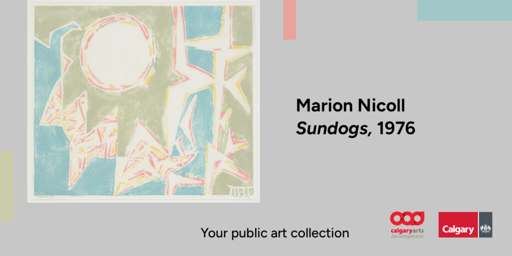
Marion Nicoll, Sundogs, clay print on paper, 1976
Born and raised in Calgary, Marion Nicoll was a painter, printmaker, ceramicist, educator, and community builder who was one of Alberta’s first abstract painters. Nicoll was the first woman to become an instructor at the Provincial Institute of Technology and Art (now the Alberta University for the Arts) and was a vocal advocate for craft as professional practice. Nicoll was an educator and mentor to many significant Canadian artists including Katie Ohe, whose work is also included in this exhibition.
Sundogs is a clay print on paper that Nicoll created using a technique she called ‘clayprinting,’ combining methods from printmaking and jewelry making. While Nicoll is most well known for her earlier hard-edge abstraction paintings, characterized by flat planes of colour and sharp, precise edges, in the 1970s, her worsening arthritis made painting a painful challenge. At this time, she started making clay prints, a move that would also shift the visual style of her work. In Sundogs, Nicoll’s clay printing technique creates lines and planes of colour that are rough and textured and far more tactile than her earlier works. An innovative approach that reflected her desire to continue to create art despite her changing body, Nicoll’s clay prints are a testament to how slowing down and shifting approaches can have surprising and meaningful results.
Sundogs depicts an optical phenomenon called a sundog or parhelion, where bright spots of light appear on either side of the sun when its light passes through ice crystals in the air. Nicoll’s sundogs are represented here as negative space, spiky forms of unpainted paper surrounded by patchy, textured areas printed in pastel green and blue. Wobbly, broken lines in sunshine yellow and earthy pink outline and add detail to the sundogs, and encircle the sun, giving the forms a sense of vibrating movement and energy that emphasizes their brief and elusive nature as visual phenomena that only last 10 to 15 minutes.
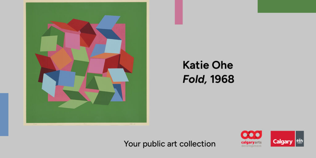
Katie Ohe, Fold, silkscreen print on paper, 1968
Born and raised in Peers, Alberta, Katie Ohe is a sculptor, visual artist, educator, and community builder who was one of the first artists to make abstract sculpture in Alberta. A major influence in Alberta’s arts communities for over 60 years, Ohe has been pivotal to the evolution of contemporary art in the province, inspiring generations of artists through her teaching, mentorship and community building. This legacy of generosity continues through the Kiyooka Ohe Arts Centre, which, in addition to housing an art gallery and a sculpture garden, is a mentoring and research centre, providing studio space, a residency program, and access to Ohe’s and her late husband Harry Kiyooka’s library and sculpture facilities.
When Ohe made Fold, she was experimenting with silkscreen printing to explore the optical effects of colour, form, and surface, and evolve her sculptural practice. Ohe’s artistic process focuses on building up an idea rather than taking elements away. Fold started as a small folding box made of cut paper, which she further explored through printmaking. Ohe did not end up pursuing a final three-dimensional sculpture for Fold, but the work remains a dynamic example of her explorations into movement and form. Composed entirely of precise, four-sided geometric shapes in shades of reds, blues, greens, and oranges, the work creates a sense of three-dimensional space within the confines of a two-dimensional plane. The result is an eye-popping optical illusion that shifts between stillness and movement like the forms are on the verge of shifting, changing, and becoming something altogether new.
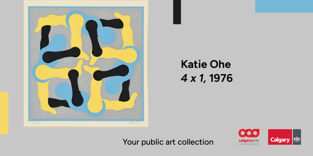
Katie Ohe, 4×1, silkscreen print on paper, 1976
4×1 is a silkscreen print by sculptor, visual artist, educator, and community builder Katie Ohe that features four multi-coloured figures printed in black, canary yellow, and sky blue. With one arm and leg extended, their bodies form an interlocking square, each holding the legs of the figure above. To create 4×1, Ohe began by making a pattern with cardboard and used pins to secure the points where the individual sections would connect and allow them to move of motion and translation between two and three dimensions, Ohe would later create a large, kinetic wood sculpture using the same composition. However, movement isn’t only found in the sculpture. The bright complementary colours draw our eyes around the image, mimicking the tumbling motion of the figures. The repeated shapes make us wonder if the image shows four acrobats balancing on top of each other, or one body in motion, captured at different moments. Whether through printmaking or sculpture, Ohe is undoubtedly a master at capturing and holding the tension of the in-between — between motion and stillness, between balance and release, between one moment and the next.
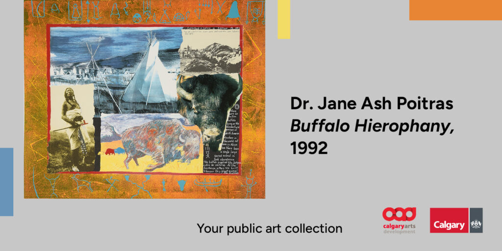
Dr. Jane Ash Poitras, Buffalo Hierophany, lithograph print, 1992
Jane Ash Poitras is an Edmonton-based painter, printmaker, writer, educator, community builder, and activist born on the Mikisew Cree First Nation in Fort Chipewyan, Alberta. Her many significant contributions to Canada’s artistic landscape have been celebrated through several awards and recognitions, including the Order of Canada, the National Aboriginal Achievement Award for Arts and Culture, and the Lieutenant Governor of Alberta Distinguished Artist Award.
Buffalo Hierophany is a lithograph print made by transferring images from a flat stone or metal plate onto paper. Through a layered composition of painting, collaged photographs and drawings, and handwritten text, Poitras builds a rich visual narrative centred on the buffalo and its sacredness to Indigenous peoples of the prairies. The work weaves themes of hope and revival, while also referencing the destruction of bison populations in the prairies by European settlers. As written along the top edge of a grainy black and white photo showing the extent of the slaughter, “Two and a half million bison were destroyed each year between 1870 – 1875”. Above this text, a second phrase acts as a reminder, “Everything in nature is sacred.” Sections of paint and delicate drawings in the four sacred colours of the Medicine Wheel — yellow, red, black, and white — overlay the collaged images and frame them within a wide, textured orange border. In the foreground, one of these images is a painting of a white buffalo, a symbol of unity, hope, and better times to come in many Indigenous cultures. Poitras has drawn shaman figures onto the buffalo’s side. Importantly, the images of bison, a pipe carrier with red accented pipe, and a teepee filled landscape layer over top of and nearly obscure the small photograph depicting the destruction of the buffalo. Through this layering, Poitras emphasizes hope, revival, ceremony and the possibility of a future where Indigenous ways of knowing and living are centred.
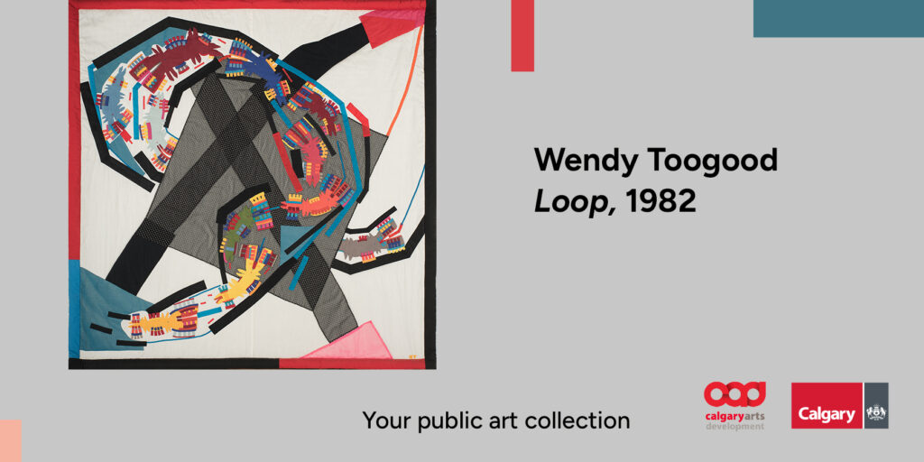
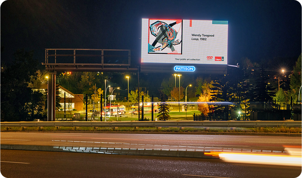
Wendy Toogood, Loop, appliqué textile, 1982
Wendy Toogood is a textile artist and educator born in Bristol, England, and currently based in Nakusp, BC. A well-known educator and mentor to many artists, Toogood taught at the Alberta University for the Arts for over 30 years and was instrumental to the development of the school’s Fibre Arts program, one of few post-secondary fibre programs in the country.
Loop is an appliqué textile artwork created by applying and layering sections of fabric that are then sewn together to create a configuration. Geometric and curved shapes build a layered composition centred on a looping, sinuous tube that passes over and behind a large, gauzy square and two long, crossed strips of black fabric. Opaque and translucent textiles create forms that shift from solid and richly coloured, to muted and semi-transparent, adding depth and contrast. This shifting effect lets us see both abstract and recognizable forms, inviting us to find patterns and figures, landscapes, rivers, roads and animals within the shapes.
The work is part of a series that Toogood explored for over a decade through textiles, collages, and murals. The series centres on the experiences and life paths of flying humanoid beings who represent all creatures of the earth who live, encounter experiences and others that change them, and inevitably, die. We find these creatures in Loop as repeated multi-coloured shapes placed inside the long, winding tube that travels across the image. Their paths are linear, and their movements are shown through small, repeating lines of colourful fabric that overlap and vibrate around their bodies. A representation of the winding journeys we each take and the chance encounters that impact us along the way, Toogood’s playful forms and open-ended depictions capture the complexity of the natural world and the countless possible paths we may follow.